THE PRINT PROJECT: A NEW TWIST
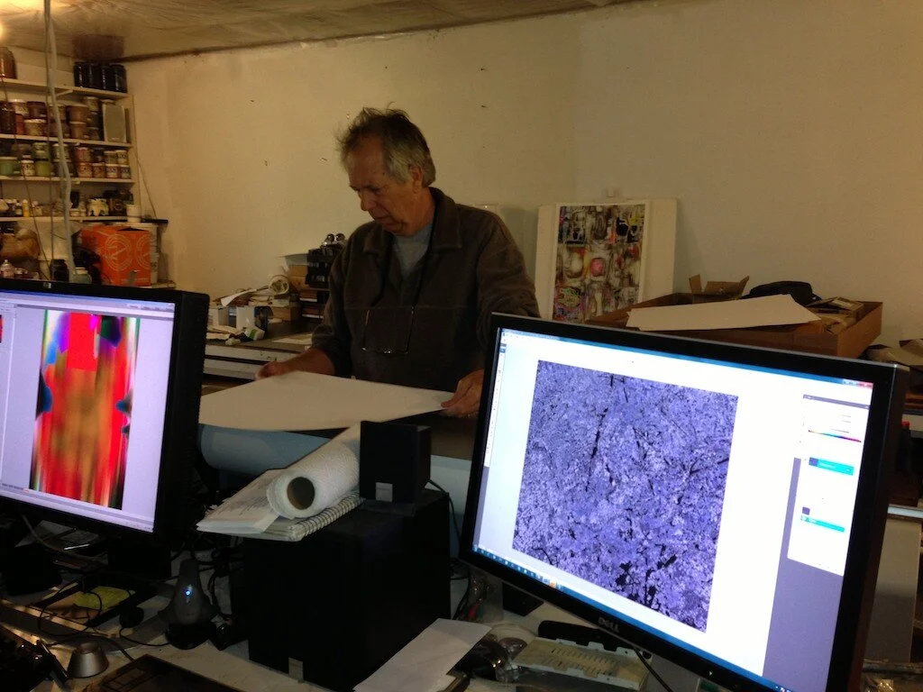
Michael Williams preparing paper for digital print.
My Print Project has taken a new turn. I have started working with artist Michael Williams making digital prints based again on the almond tree image. He is helping me alter the image in Photoshop. It has taken the print in a new direction, which I would call a Monet/Wharhol remix.
Michael has been working almost exclusively in digital prints for years. He creates his work directly on the computer and alters it in Photoshop. I like this use of digital technology, more than using it for reproductive purposes. The issues are quite different. Instead of trying to reproduce a fact-simile of something else, the computer itself becomes the medium in which the artist works.
On my journey through the print process, I have been looking for a way to express in print what I am able to do in paint, but different. With Tim Sheesley at Corridor Press, I learned many of the attributes of lithography and I pushed hard to see how I could use that medium to get the effects that I wanted. The process was labor intensive, taking me months to produce the plates and days to print out the various color combinations. With each effort I found what the medium could and could not do for me.

Large scale digital print.
With that knowledge in the back of my head, I went to Michael to see what we might do in digital medium. Well, as the old ad used to say: "This is your brain on drugs.". In this case, this was my print on drugs. With a click of a button we could move the print through many color permutations. But again, I wanted a print where it felt as though the light was popping out of it. We would land on a set of colors print it out, adjust and repeat.
In this process I made the most important discovery of all, some thing that took me right back to my original concept. When I first started out I wanted to put 9 prints together to make something the equivalent in size of the original painting. After spending three months of drawing the plates and seeing what a complex process it was to print all the colors, I abandoned that idea. But as Michael and I printed out the digital prints it was obvious to both of us that the print was screaming to be BIG!
Michael comes from a background of making large abstract paintings. And he spent quite a bit of time working with Ken Noland. If anyone was sensitive to the importance of scale, it would be Michael. We have found that a print about 30 by 40 inches is doing the trick for us. But guess what happened then. I took one of our images and starting painting it on a canvas larger than the original painting, which was 60 by 70 inches. I think I needed this long apprenticeship to discover something about my paintings. I love each permutation of the print, but now I am excited to get the image back into paint.
No matter where you go, there you are!