THE PRINT PROJECT: WORKING WITH A MASTER Part 1
In early December I spent two days at Corridor Press in Otego, New York, working with Master Printer, Tim Sheesley. In two twelve hour sessions we were able to put together proofs for a suite of four prints that were inspired by my painting "Almond Tree - Biot". I was blessed with beginner's hubris. Creating a print with just the right color, using four plates would have been project enough for one day. To get four of them completed in two days was an insane proposition. This is where the experience of a Master Printer made all the difference.
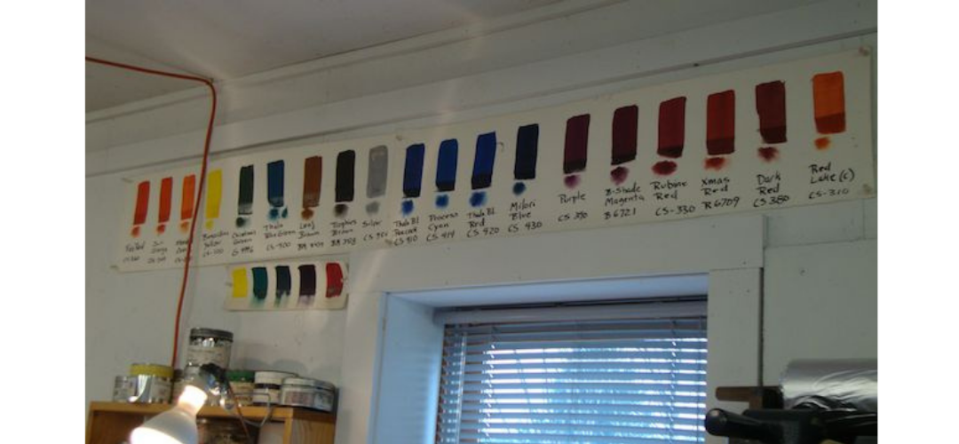
I had worked out all of my color combinations ahead of time. With the help of graphic designer Chelsea Nye, I made a virtual print in Photoshop. We generated computer swatches of color for each plate, which I then converted into color samples made in oil paint. I sent my color swatches, along with the names of the oil colors I used to Tim and he made a sample print from these instructions. What I did not know was that a print maker's palette of litho-inks is not the same as a painter's palette of oil colors. Lithography inks must be transparent. Some of my oil color pigments are opaque and cannot be used in lithography ink.
For example, none of his blues approximate ultramarine blue, a color I use extensively. He was able to mix a blue that looked very much like ultramarine blue, but it didn't have the purity or brightness of my blue. The mixture of colors had dulled the effect. Tim is not only a print master, he is a color master. He mixed any color I gave him perfectly. However, as with the blue, occasionally there was a limitation inherent in the pigments available.
Tim is used to working with artists who have a concept in mind and the expectation that they will be able to produce that concept exactly. In Tim's experience, watercolor artists are the most insistent in this regard. Tim was very concerned I would blow a gasket when I came up against the limitations of his palette. What he didn't know, was that secretly I was hoping to use this project to expand my experience -- to find new and unexpected ways to interpret my work. This road block was just the sign I was looking for to head off-road and see what adventures awaited me in the woods.
The first step was a tiny one -- abandoning my concept of ultramarine blue for one in his palette that could give me the quality of light I was after. But changing one color has a domino effect -- all the other colors had to be changed to work with that color. If it is the 3rd color you have added to the print, it can cause mayhem. In this process you start with one color, then try to make the next one work with it. The third color has to work with the first two and so forth. This is a tightrope walk, especially when everything about your print is an expression of color.
As a painter I noodle and adjust colors all the time, sometimes scraping up a color from a palette of a previous painting and using it in a new one. That can't happen in print making, because you have to be able to replicate the color perfectly for each print. Each color you use must be recorded with a formula and connected with that specific print, as well as with a certain plate from that print. You have to record all of this information for each mixed color, whether or not that color is ultimately used. This is because you may make several versions and compare them before you settle on the perfect color combination.
We were not doing this for one print, we were doing this for four! But we did not do one print at a time. Since the prints shared colors on certain plates, we were doing all four versions at once. That we both didn't get a migraine is a small miracle, although I noticed that at the end of the day, we were both unable to put a sentence together, as simple words escaped our memory.
The Print Project: Working with a Master Printer - Part 2 Click Here


