
NICHOLAS BENSON AND THE LETTER FORM BEFORE TYPE

I was messaging with Nick Benson, the stone carver and MacArthur Fellow, about the typeface that I had chosen for my logo. I was happy with how it conveyed something about me, both my straight forward attitude about some things and my quirkiness. It is a lot to ask of a font. His response was enlightening.

LP Logo

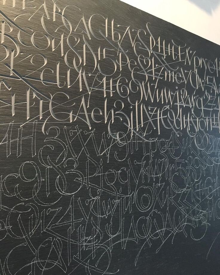
"I like it for your particular application, and certainly with the graphic context of the web in mind. The forms are clean and clearly constructed, but they also give you a bit of whimsy with the K and the R. The problem with me is that I have been raised in this environment of the John Stevens Shop, and with that comes the study of a massive history of letterform - more importantly, letterform as it existed before type. Type lacks the soul of the hand. No matter how precisely a form is rendered for typographic use - or inversely, how consciously loose it is made - lines and bodies of type do not have the same quality of the written, or brushed form. To make a leap, they lack the integrity that your paintings have, and I mean integrity in terms of integration. All of your strokes were meant to be on the same page interacting with each other to make the whole. The same is true for a line, or body of lettering, as far as I am concerned. As it is drawn, written or brushed each letter of a word, line or paragraph is meant to go with the former and the latter. A beautifully brushed body of lettering is not a collection of individual letters but a single drawing in which each character depends on its relationship the those on either side of it.This is certainly a purist view and one that boarders on the monastic. Click on the image I use for the header of my profile page and you will see one of the finest examples ofwhat I am trying to describe." And this is what Nick is working on now.