
THE PRINT PROECT: Research - Looking at the prints of Joseph Raffael and Bonnard

Joseph Raffael
Last week I went to France. I was hoping, among other things, to meet the artist Joseph Raffael and ask him about his print making efforts. Years ago, Tim Sheesley, the master printer at Corridor Press with whom I will be working, assisted with the production at Tamarind Institute of one of Raffael's lily prints. Raffael's extensive use of color and his ability to achieve complex color combinations in print is what most interested me. In printmaking you have to think reductively, achieving many colors through the use of a few. Each plate that you make is a different color. So, when you make the yellow plate, you have to put yellow not only where there is yellow, but also where there is orange (red and yellow) and green (blue and yellow) and brown (degrees of all three colors).

J.Raffael-, Lithographic print, Mandala Bouquet
Surrounding Antibes, where Raffael lives, is a region rich in print history. How could it not be, when Picasso, Matisse,Chagall, Leger and Bonnard all lived and worked there. As did Max Ernst,Jean Dubuffet, Yves Klein and Ben.While there, I visited the Bonnard Museum in Le Cannet, which opened in 2011. The museum occupies a restored 895 square-foot Belle Epoque villa that organizers saved from demolition. Currently, it has a permanent collection of approximately 150 works, including posters, drawings, sculptures, photographs, and 15 oil paintings, the vast majority of which were completed at Le Bosquet, according to the Financial Times. The museum is run by the municipality, and the majority of its funds came from a €2m fund, long-term loans and donations from the Meyer Foundation and Bonnard's great-grandniece Isabelle Terrasse. [Julia Halperin]
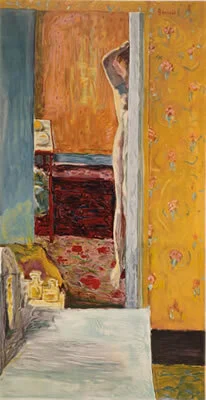
Bonnard-nu
There I found a very successful lithograph. Like the prints of Raffael, it had both the light and intense color of a Bonnard painting. I noticed that he had enhanced the print with gouache. This didn't surprise me as Bonnard was famous for retouching his work. In fact, Picasso once remarked:"Another thing I hold against Bonnard, is the way he fills up the whole picture surface, to form a continuous field, with a kind of imperceptible quivering, touch by touch, centimeter by centimeter, but with a total absence of contrast. There's never a juxtaposition of black and white, of square and circle, sharp point and curve. It's an extremely orchestrated surface developed like an organic whole, but you never once get the big clash of the cymbals which that kind of strong contrast provides. What Picasso hated about Bonnard, is, I believe, what the rest of us love about him. There was much here for me to carry away, as I think about how I will approach my own prints.I am looking at lots of prints now, especially prints by painters, as I research ways that others have used the medium.