
April Notes - 2026
IS THE ARTIST’S PALETTE BIOLOGY OR TASTE ?
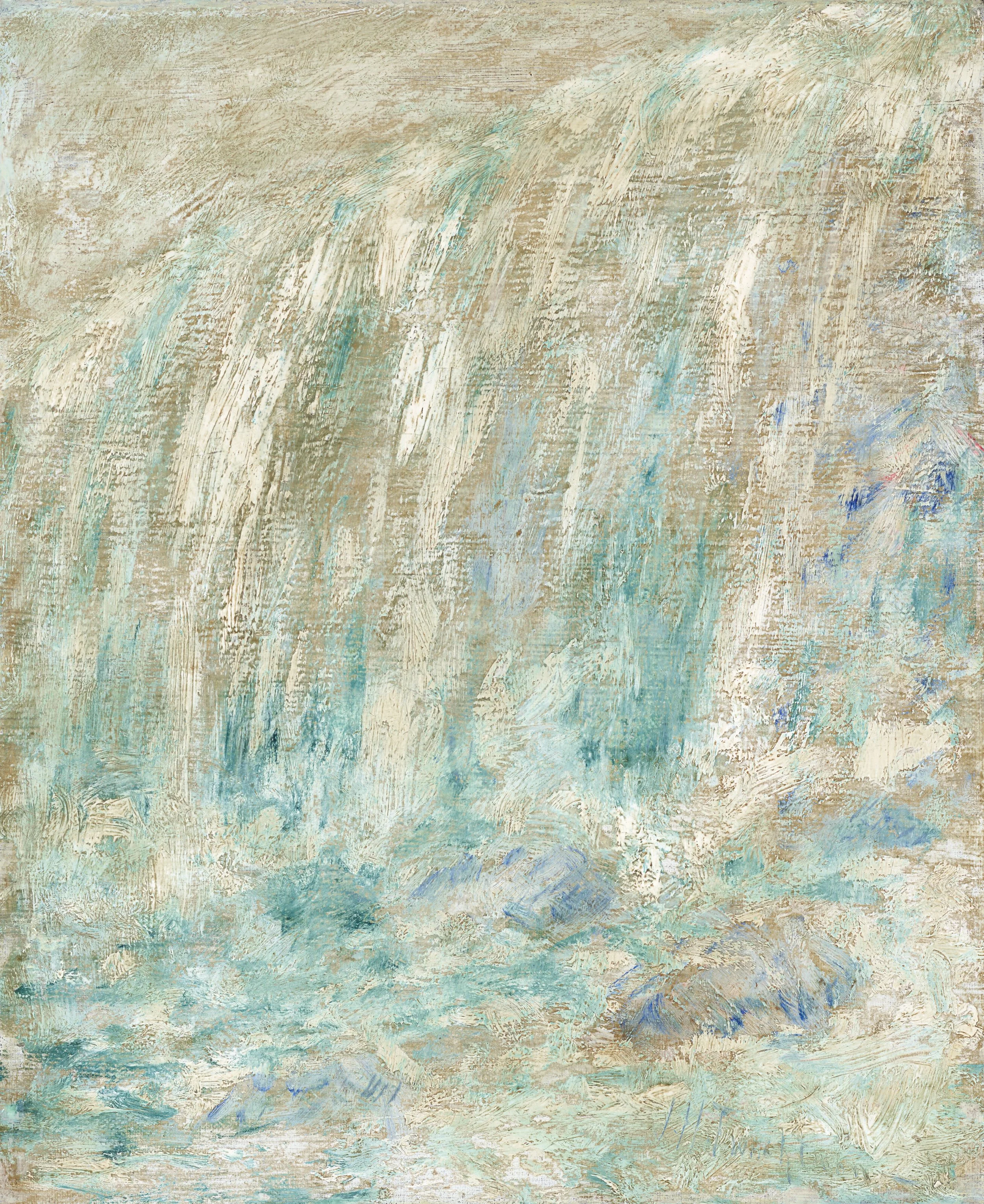
JOHN HENRY TWACHTMAN (1853-1902), Niagra Falls
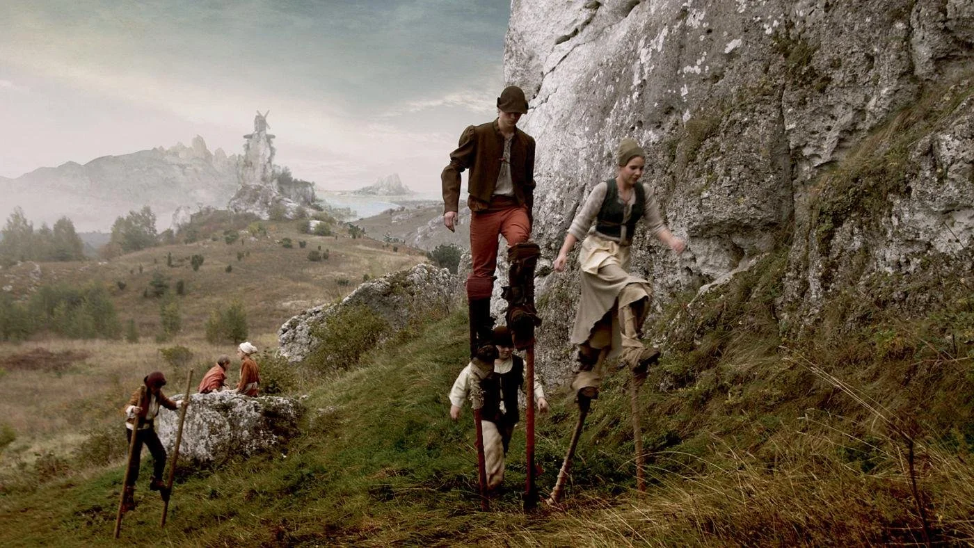
I once attended a dinner at Jan and Warren Adelson’s home. Their New York gallery is known for its collection of American Impressionists and the work of John Singer Sargent. As I moved through the house during this charity event for the Hudson River Museum, I began to recognize paintings at a glance—Sargent and Eakins, a drawing by Ingres, a grisaille gouache by Homer, a medallion by Saint-Gaudens. Nothing was labeled. It was a home, not a museum. But the work announced itself.
Then, over a desk, there was a painting that stopped me. At first, it looked like scratches of color. After a moment, a waterfall began to resolve, but what held me was the color—a very particular Veronese green. And then it clicked: Twachtman. John Henry Twachtman. Adelson confirmed it.
I’ve always been struck by how specific an artist’s palette can be. Not just a preference for color, but something closer to identity. You can come around a corner in a museum, catch a glimpse of a painting before you’ve registered what it is, and know who made it.
That raises a more interesting question than recognition.
Where does that distinct palette come from? READ MORE . . .
IN SEARCH OF COLOR
I was watching a short Instagram video by @evie_hatch, an art historian and pigment specialist, about a material I had never really considered before: Vivianite.
She was showing this strange, unassuming substance—something that can begin almost colorless, even gray—and then, with exposure, with time, it turns blue. Not a bright, declarative blue. Something quieter. A blue that seems to come into being rather than arrive fully formed.
ALSO NEW THIS MONTH
In search of Blue: Matisse paints Chardin
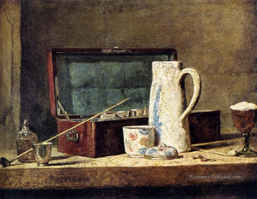
In the 1890s, Matisse was methodically working his way through the great paintings of the Louvre, studying these artists as a writer would study literature. He was determined to paint like the great masters. He started with Chardin's The Pipe, the first painting that Matisse copied in the Louvre. He was confounded by the elusive blue on the padded box in the center of the still life; a blue that could appear pink one day and green the next. He tried everything to unravel the mystery of this color: examining the color under a magnifying glass, analyzing the light on the objects, studying the texture, the weave of the canvas, and the glazes. He even cut up his own study and put bits of his colored canvas next to the Chardin to match the color exactly, and yet when he put it all together, it didn't work.
Van Gogh Spins a Yarn
"In [Van Gogh's] studio, he kept a lacquered box containing balls of brightly colored yarn that he endlessly twined and untwined to test the interaction of colors - exactly the procedure described by Chevereul, who had developed his theory as director of dyes for the royal looms at Gobelins." [Van Gogh: The Life, Steven Naifen and Gregory White]


Kind of Blue
When I found John Williams the morning of our pilgrimage to our art mentor, John Semple -- It’s a Gift to be Semple, posted in August -- I was stopped dead in my tracks by John's blue shirt. It wasn't the shirt; it was the color: a near-indefinable blue hovering between two hues. I told John that I thought it was an extraordinary blue, and he concurred, saying that he loved how each part of the shirt, cut from different parts of the bolt of fabric, faded differently.
NOT A REMBRANDT: On the Art of Knowing Without Thinking
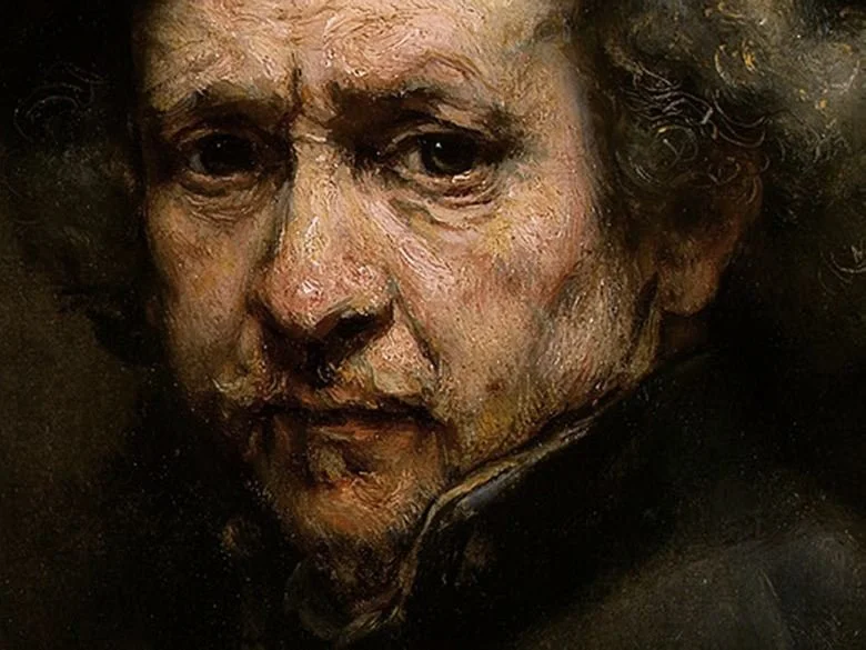
I once traveled to California with a friend, where we stayed with some friends of hers. They had a Rembrandt portrait hanging in their hallway—or so they said. When they asked me what I thought of their Rembrandt, I blurted out, “That’s not a Rembrandt.”
And then I froze. Oh my God, I thought, they can’t possibly think this painting is a Rembrandt. They must be testing me.
But they weren’t testing me. . .
FROM THE LIBRARY: Johannes Itten - The Art of Color
For this book, you might want to head to a university library to look at it. There are copies online, but it is long out of print and very expensive.
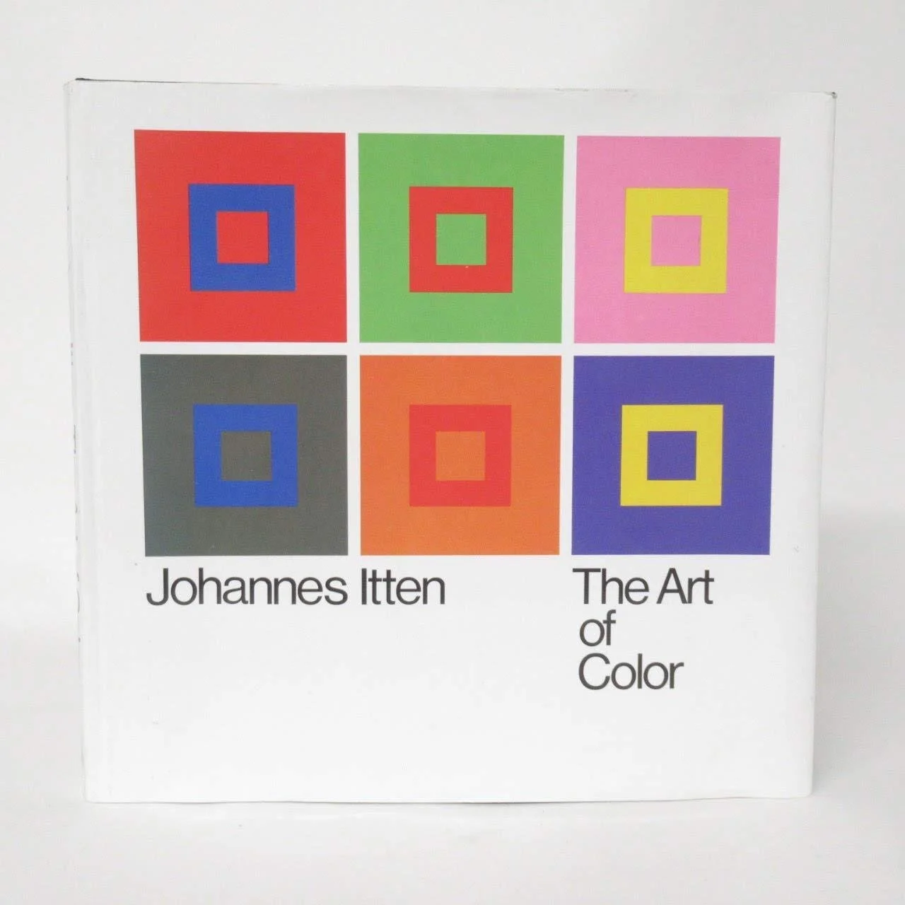
Johannes Itten’s book, The Art of Color, is what prompted my interest in finding out if one’s choice of palette was biological or something else. What made me think this was an exercise he gave his students to “doodle” with colors, then make a grid and add the colors to the grid in the proportion that they appeared on the page. I don’t know if he further told them to choose colors that they felt were their colors or not. What he did observe—and this is documented in his teaching—was that when students worked intuitively, their choices revealed something unmistakably personal. He called this “subjective color,” and noted that people tend to select colors that correspond to their own physical and psychological character. In each case, the colors strongly reflected their own physical coloration.
From there, the book opens out into something much larger. Itten sets up a framework that moves between two poles: the deeply personal experience of color, and the more formal, almost architectural logic of how colors relate to one another. He organizes this through his now well-known systems—the color wheel, the color sphere, and the seven contrasts—but these are never presented as rules to follow. They are tools to sharpen perception.
What makes the book endure is that it doesn’t reduce color to theory. The illustrations carry as much weight as the text—comparisons, exercises, small paintings that show how a color shifts depending on its neighbor, how it advances or recedes, how it holds or dissolves a form. You begin to see that color is never stable. It is always relational, always contingent.
For me, what lingers is the tension he maintains. On the one hand, color arises from something internal—what he would call the “aura” of the person. On the other hand, it exists within a structure that can be studied, tested, or even measured. The book doesn’t resolve that tension. It leaves you working inside it. Which is, I think, exactly where painting happens.
ON SCREEN: The Mill and the Cross by Lech Majewski
For those of us who like to watch paint dry, let me recommend The Mill and the Cross. It doesn’t so much tell a story as inhabit a painting—moving slowly through Bruegel’s world until you begin to see how attention, placement, and time construct meaning. Figures emerge, hold for a moment, then recede. What first reads as a landscape begins to organize itself, not around a single event, but across the surface.
The film is built from The Procession to Calvary by Pieter Bruegel the Elder, but it isn’t an illustration of the painting. It’s closer to an act of looking extended in time. You begin to register how the eye moves, how meaning is distributed, how something as simple as placement carries weight. It’s slow, and deliberately so. But if you stay with it, it comes surprisingly close to the experience of standing in front of a painting and realizing that nothing in it is accidental.
EXHIBITION: LUMINOUS COLOR
"Luminous River," 40 inches x 30 inches, oil paint and acrylic markers on canvas, © 2025 Leslie Parke
LUMINOUS COLOR
LESLIE PARKE and STEVE EASTON
SATURDAY, 9 MAY 2026 -
SATURDAY, 13 JUNE 2026
JESSICA HAGAN FINE ART + DESIGN
Jessica Hagen Fine Art + Design
9A Bridge St.
Newport, Rhode Island
02840