
IS AN ARTIST’S PALETTE BIOLOGY OR TASTE?
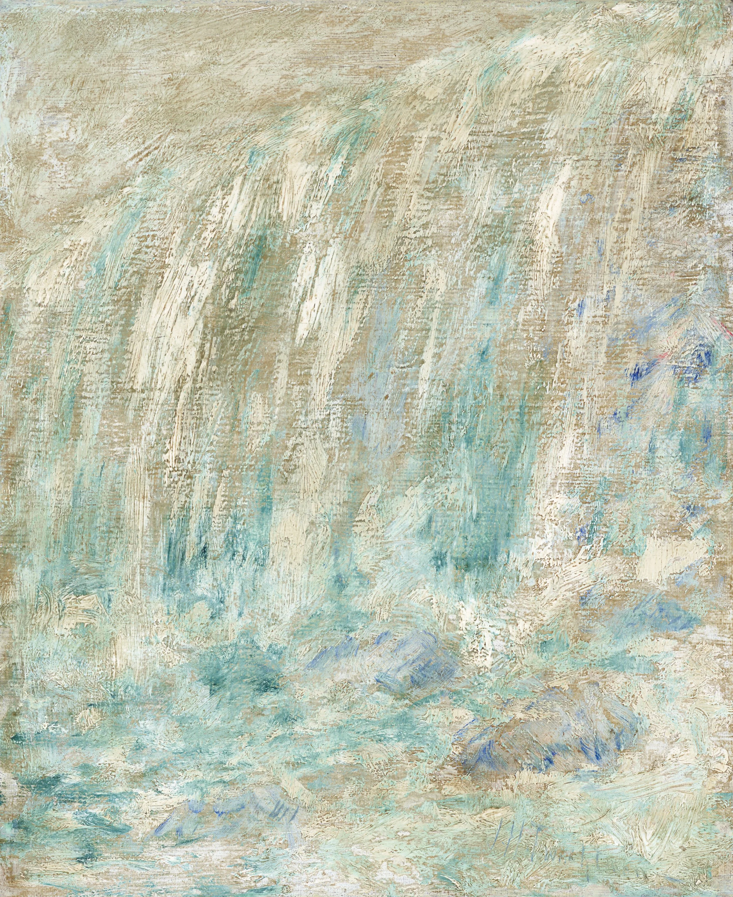
This is not the Twackman I saw, but one in the Metropolitan Museum. The bluish green in the upper left hand corner is the color I am talking about.
I once attended a dinner at Jan and Warren Adelson’s home. Their New York gallery is known for its collection of American Impressionists and the work of John Singer Sargent. As I moved through the house during this charity event for the Hudson River Museum, I began to recognize paintings at a glance—Sargent and Eakins, a drawing by Ingres, a grisaille gouache by Homer, a medallion by Saint-Gaudens. Nothing was labeled. It was a home, not a museum. But the work announced itself.
Then, over a desk, there was a painting that stopped me. At first, it looked like scratches of color. After a moment, a waterfall began to resolve, but what held me was the color—a very particular Veronese green. And then it clicked: Twachtman. John Henry Twachtman. Adelson confirmed it.
I’ve always been struck by how specific an artist’s palette can be. Not just a preference for color, but something closer to identity. You can come around a corner in a museum, catch a glimpse of a painting before you’ve registered what it is, and know who made it.
That raises a more interesting question than recognition.
Where does that distinct palette come from?
Is it something physical—set in the eye, or even in the genes—or is it built over time, shaped by experience, materials, and habit?
The first surprise, for me, was how much of it begins in the eye, and how concrete that actually is.
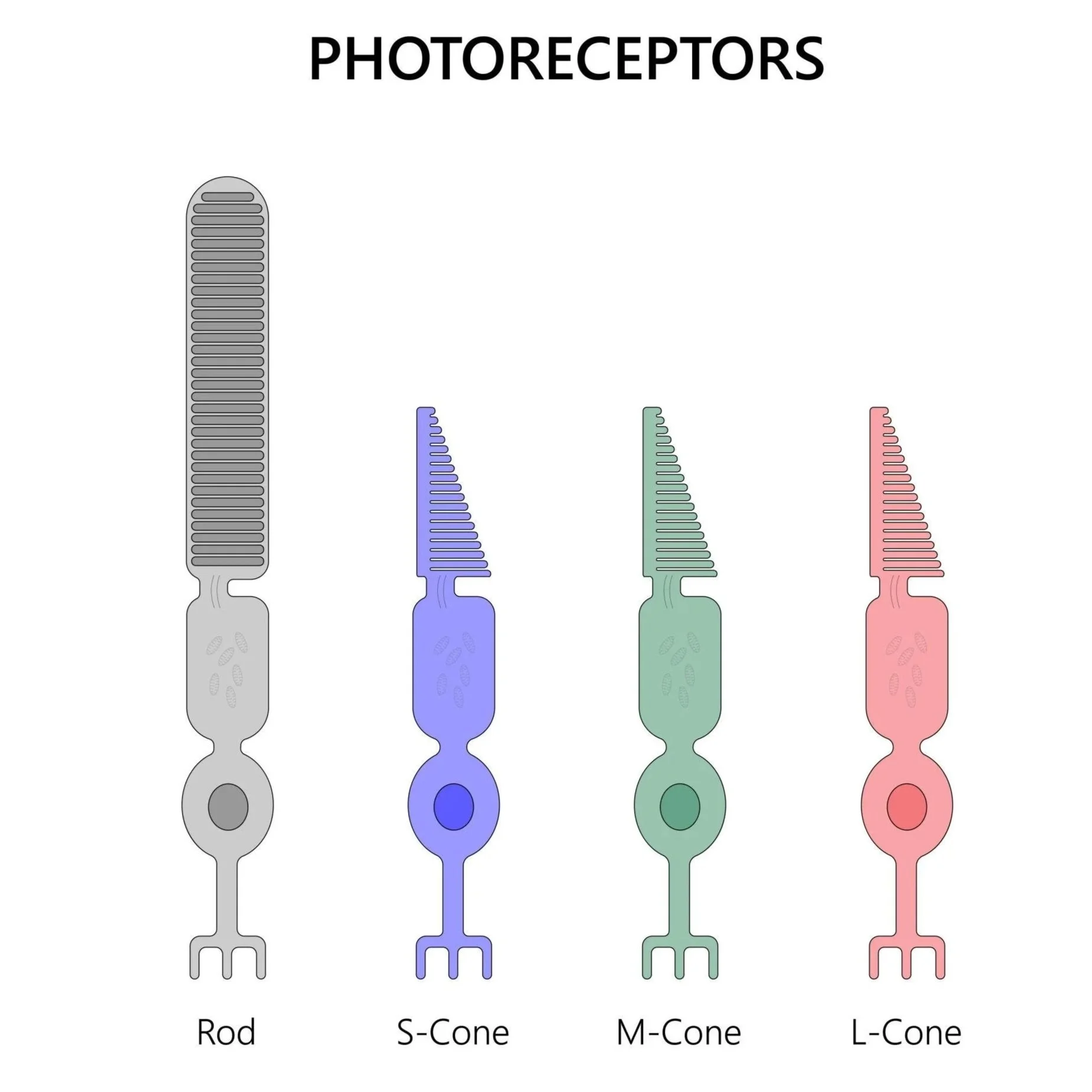
Color starts with cone cells in the retina. Each cone contains a light-sensitive protein called an opsin. These opsins are tuned to different parts of the light spectrum—one toward long wavelengths (reds), one toward medium (greens), and one toward short (blues). The genes that code for the red and green opsins—OPN1LW and OPN1MW—sit on the X chromosome, which is why variations in red–green perception are relatively common, especially in men.
This means not everyone is working with exactly the same set of distinctions. Some people can separate certain hues more easily; for others, those same hues compress or blur. The differences are often subtle, but they are real.
Still, that doesn’t give you a palette. It gives you a range.
Within that range, something else happens almost immediately. The brain does not treat color as neutral information. It assigns value to it. Studies in neuroscience show that even when people are simply looking at color—no task, no decision—areas of the brain associated with preference are already active.
Some combinations feel resolved, others feel off. That sense of “this works” is not a later judgment; it’s built into perception itself.
You begin to see how repetition might take hold. An artist finds a set of relationships that feel right, uses them again, and over time, those choices stabilize. Not as a rule, but as a tendency. A kind of internal gravity.
But that still doesn’t explain why one artist’s color feels like theirs and not someone else’s.
Because experience keeps entering the picture.
There’s a well-supported idea in psychology—ecological valence theory—that we tend to like colors associated with things we like, and avoid colors associated with things we don’t. Blue often ranks highly, possibly because of its association with sky and water. But once you move beyond those broad tendencies, it becomes personal.
An artist’s palette can carry the imprint of where they’ve lived, the particular light they’ve worked in, and the surfaces and objects that have held their attention. It accumulates. It is learned, not in a formal sense, but through exposure and repetition.
And it continues to change. Studies show that infants already display patterns of color preference, but those patterns don’t match adult preferences. Something shifts with development, with language, with culture. Cross-cultural research shows both shared tendencies and clear differences—what feels balanced or luminous in one context may not in another.
By the time an artist is fully formed, the palette is no longer just perceptual. It has been trained.
Painters develop ways of mixing that become second nature. A particular gray. A way of warming or cooling without losing structure. These are not reinvented each time. They are practiced pathways. There’s even evidence that this kind of training alters the brain itself—painters show measurable differences in areas involved in color processing compared to non-painters.
Then there are the materials, which quietly shape everything.
Pigments have limits. Some are unstable, some react badly with others, and some simply don’t exist at a given moment in history. Monet, for example, is known to have abandoned emerald green because it did not behave well with certain yellows he was using. That’s not aesthetic preference in the abstract. That’s the material pushing back.
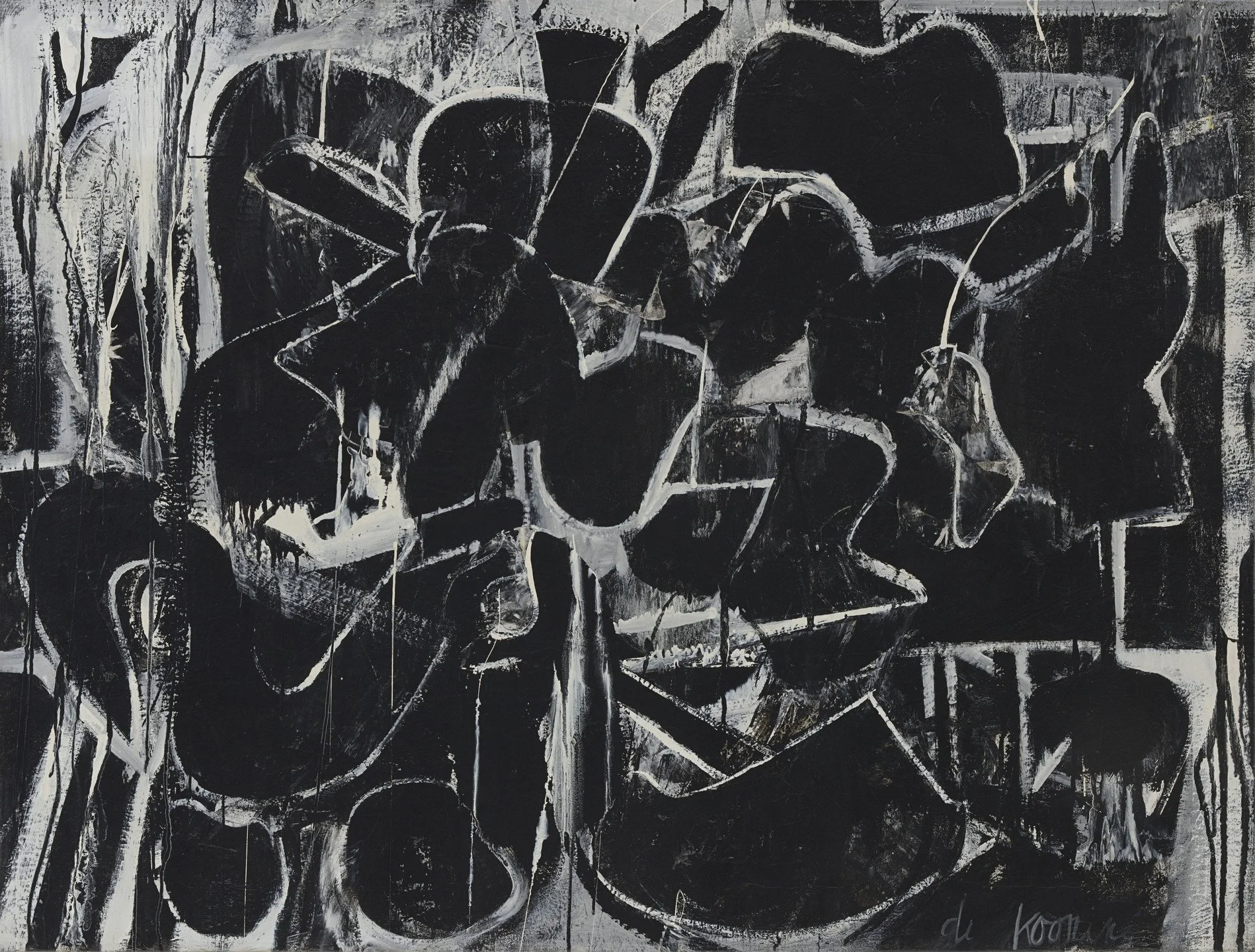
deKooning- Painting, 1948, MOMA
De Kooning’s black-and-white paintings arise from a different kind of constraint. He could buy black-and-white house paint in bulk cheaply and work quickly. He said as much. That restriction—practical, economic—became a defining visual language.
At a certain point, what is available and what works begins to repeat. And repetition is what turns choice into signature.
Sometimes, later in life, the body re-enters the process.
Monet’s cataracts are one of the clearest examples. As the lens of the eye yellows, it filters the light reaching the retina. Blues become harder to perceive; colors lose intensity. Monet wrote about this. You can see it in the paintings. They darken, the relationships shift, the palette tightens. After surgery, it opens again.
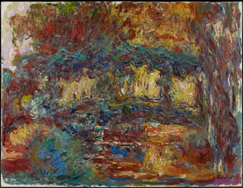
Claude Monetc. The Japanese Bridge, 1923-25, Bequest of Putnam Dana McMillan
Here, biology doesn’t create the palette, but it modifies it in a visible way.
And then there is the larger context—the fact that artists are not only making work, but they are also being seen.
Over time, a consistent palette becomes legible. It allows others to recognize the work, to place it, to follow it. The art world often speaks of an artist’s “vision,” which is partly a way of describing this coherence. Not imposed, exactly, but reinforced.
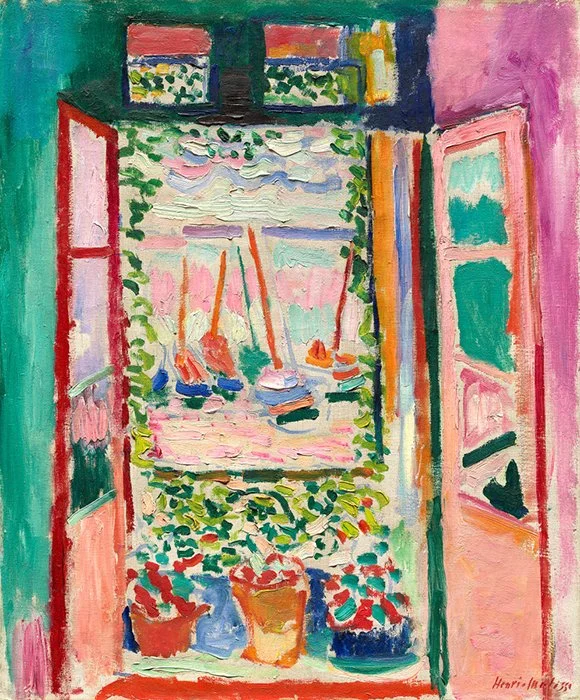
Henri Matisse, Open Window, Collioure, 1905, oil on canvas, 55.3 x 46cm (National Gallery of Art, Washington)
Movements do this collectively. Fauvism, for example, redefined color as expressive rather than descriptive. Matisse’s color is not tied to what he saw; it is tied to what color could do. That shift is cultural and theoretical, not biological.
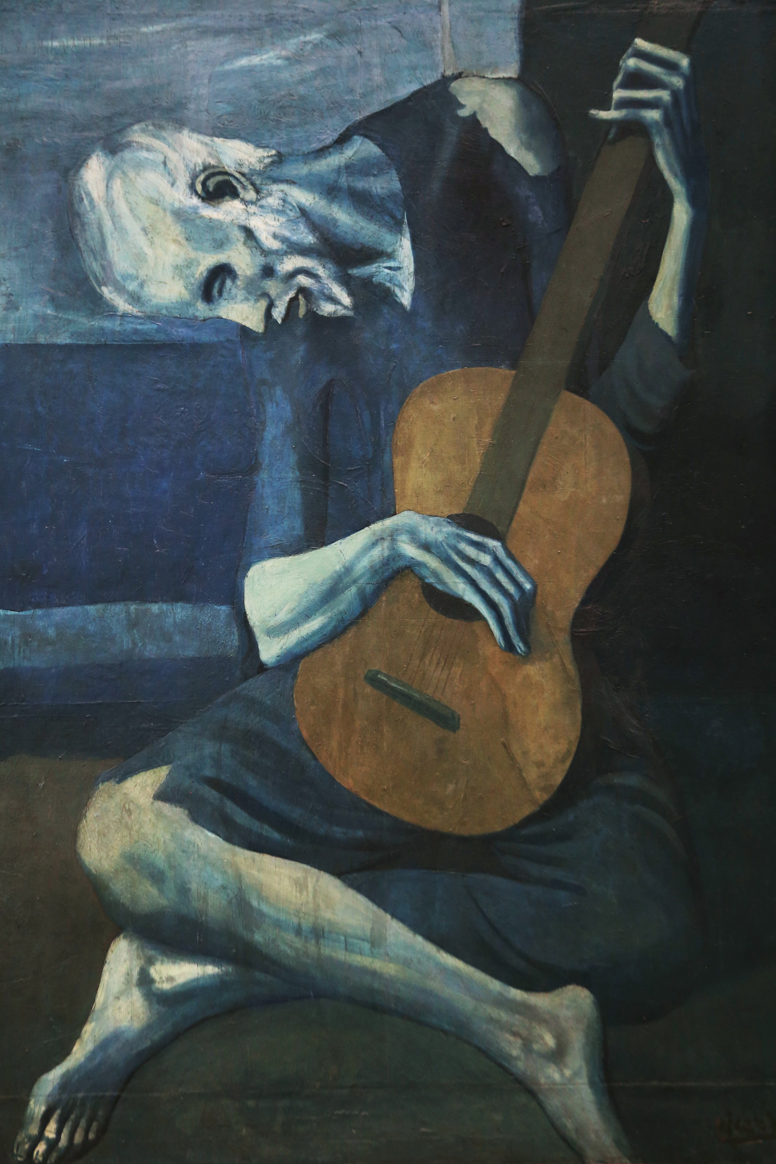
Picasso, The Old Guitarist, 1903-1904, The Art Institute of Chicago
Picasso’s Blue Period is another case. The palette is unmistakable, but it is anchored in mood, in biography, in a sustained decision to stay within a narrow range and explore its possibilities. Technical studies show his use of specific blues—Prussian blue, ultramarine—but the persistence of blue is not forced by the materials. It is chosen, and then held. (Although I had been told that Picasso’s Blue Period was not an artistic decision, but one of necessity, a matter of the paint he had at hand, when he could not afford to buy paint.)
Rothko further complicates the idea of the palette. His work is often described in terms of color—reds, maroons, violets—but what defines it is the way those colors interact: the edges, the layering, the slow transitions. Recent research has tried to measure this, treating the palette not as a list of hues but as a set of gradients and relationships. His color is not fixed; it hovers.
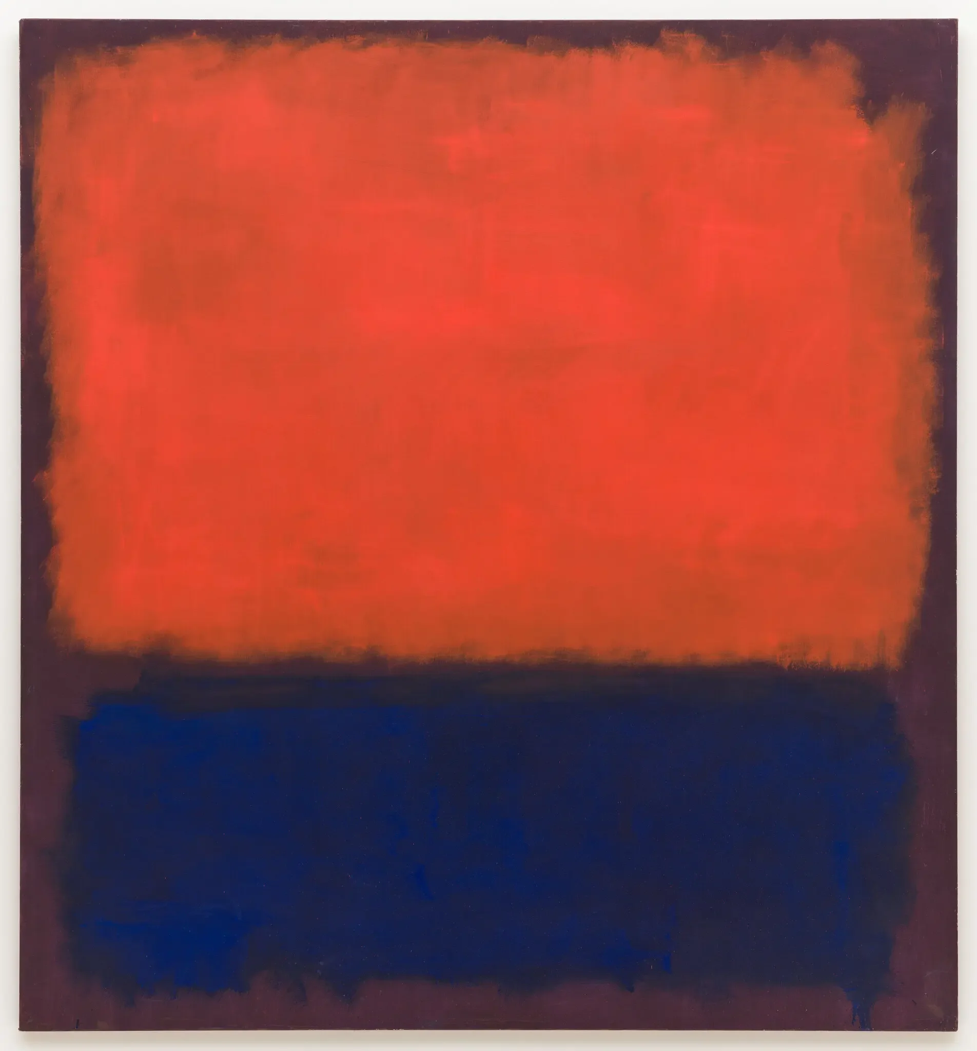
Mark Rothko’s “No. 14” (1960) at the Fondation Louis Vuitton in Paris.Credit...Kate Rothko Prizel and Christopher Rothko/Artists Rights Society (ARS), New York
And even there, the materials continue to act. Some of the colors in the Harvard Murals faded because of the pigments he used. What we see now is not what he painted. The palette continues to shift after the fact.
So if you come back to the question—where does an artist’s distinct palette come from—the answer is not singular.
It begins with what the eye can register.
It is shaped by how the brain assigns value.
It accumulates through experience and association.
It is refined through training and repeated use.
It is constrained—and sometimes redirected—by materials.
It can be altered by the body over time.
And it is stabilized, in part, by the simple fact that consistency becomes recognizable.
In the end, a palette is not given.
It is built—slowly enough that, once it’s there, it can feel inevitable.