“Color has pulses, and those pulses can lead you from one dimension
to another dimension to another dimension.”
—Kenneth Noland
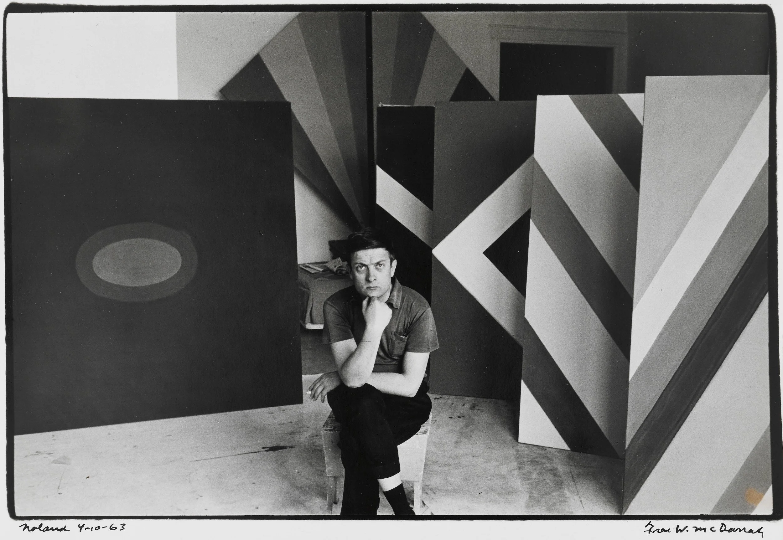
Kenneth Noland, New York 4/10, 1963, 1963, gelatin silver print, 8 x 10 inches (20.32 x 25.4 cm), Collection Buffalo AKG Art Museum, © Estate of Fred W. McDarrah
When I was a student at Bennington College, Kenneth Noland lived a few miles away in Shaftsbury, Vermont. He had nothing officially to do with the college while I was an undergraduate, but his presence was felt. Artists and critics who came to see him would sometimes turn up at Bennington—Larry Poons, Tony Caro, Clement Greenberg.
When I became a graduate student, Noland taught a course that I took. He was surprisingly practical. He talked about how we arranged our studios and how we dealt with all the things that pulled us away from the work. He was interested in the circumstances of being an artist: how you set things up so that you could keep painting.
We visited his studio and his home. I remember a Matisse ink drawing and a very small Rothko.
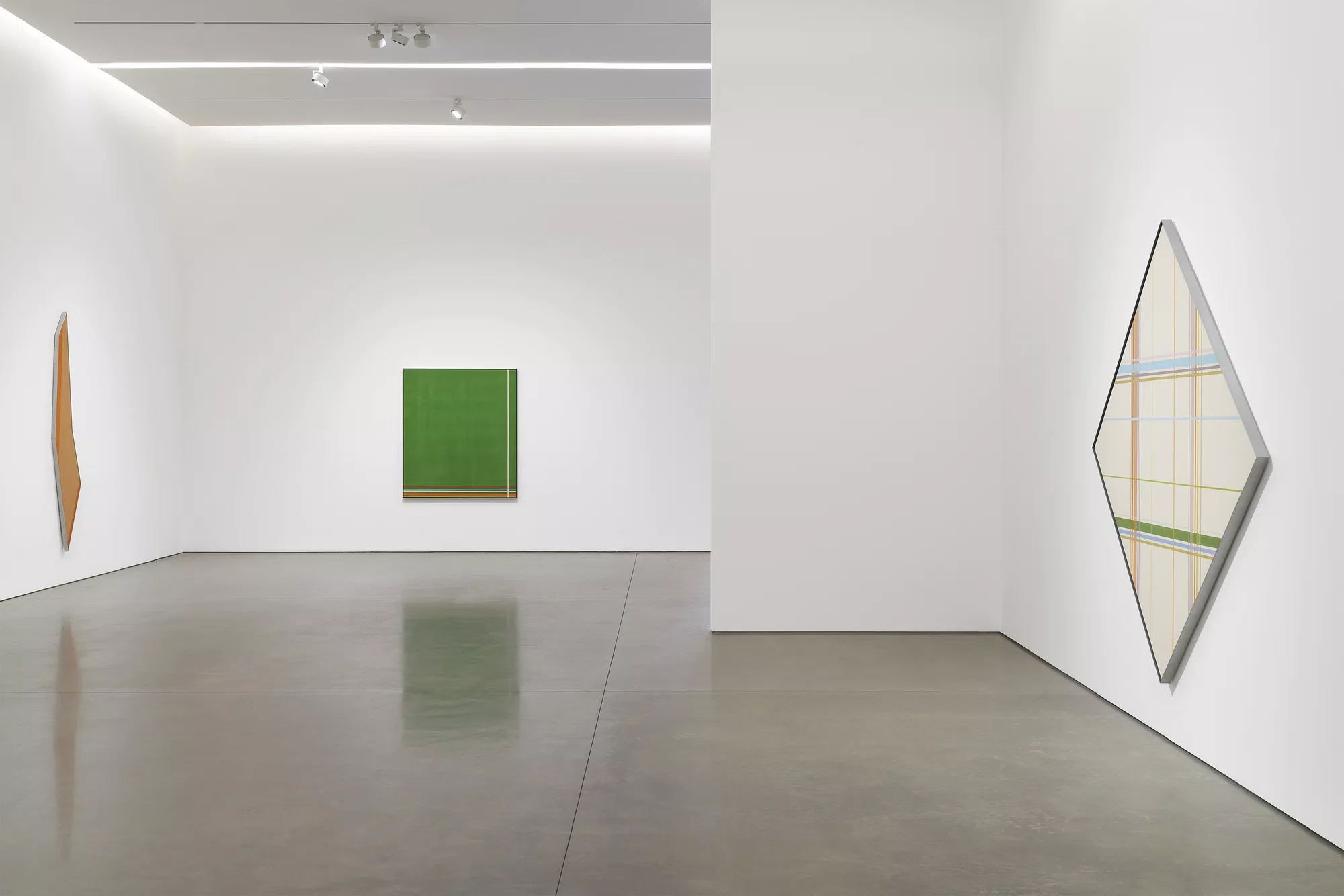
Noland at Pace Gallery
By then Noland had already made the paintings for which he is best known: the circles, the chevrons, the diamonds, and the enormous horizontal stripe paintings of the late 1960s.
It may be difficult now to understand how startling those stripe paintings looked. We have seen so many stripes since. But these paintings appeared after Abstract Expressionism, when a painting was still expected to carry the evidence of the artist’s hand—the sweep of an arm, the pressure of the brush, the drip, the correction, the struggle.
Noland removed almost all of that.
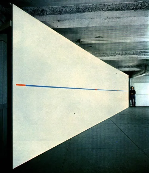
The stripe paintings were composed of horizontal bands of color running from one side of a long canvas to the other. There was no central image and very little conventional composition. The circle and chevron paintings had given the eye an emblem to hold on to. In the stripe paintings, the eye had to travel.
Some were so wide that they could not be taken in all at once. Atoll Sun, painted in 1968, is nearly twenty-four feet long.
The structure was simple enough to allow every difference in the color to register: a narrow stripe beside a wide one, a cool blue against an orange, a pale interval between two saturated colors. The painting was not an image made out of stripes. The stripes were the painting.
Noland studied at Black Mountain College after the war. He took a course with Josef Albers, but Stephanie Noland told me that he did not particularly like Albers and that Ilya Bolotowsky was the more important influence.
She was emphatic that Noland first met Bolotowsky in Paris, where Noland had gone to study with the sculptor Ossip Zadkine. He later studied with Bolotowsky at Black Mountain.
In Washington, Noland became close to Morris Louis. In 1953, Clement Greenberg took the two painters to Helen Frankenthaler’s studio, where they saw Mountains and Sea. Frankenthaler had poured thinned paint directly into unprimed canvas. The paint did not sit on the surface as a separate skin. It soaked into the cloth.
Louis and Noland returned to Washington and began experimenting with staining. Their work developed differently. Louis poured streams of color, eventually making his vertical Stripe paintings, in which the colors gather into a compact column. Gene Davis used repeated vertical stripes to establish a rhythm across the entire canvas. Noland’s stripes moved horizontally, often across a panoramic field, and depended on the precise intervals between one color and the next.
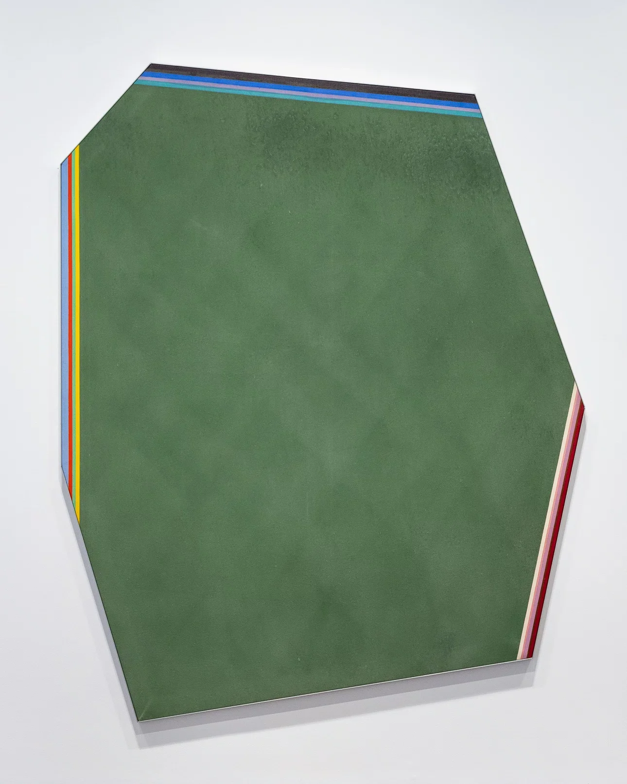
Kenneth Noland, Glean, 1977, acrylic on canvas, 93" × 76-1/2" (236.2 cm × 194.3 cm)
All three painters used the stripe, but the stripe behaved differently in each one’s hands.
Stephanie described Noland’s central concern very simply:
When color met color, something emotional happened.
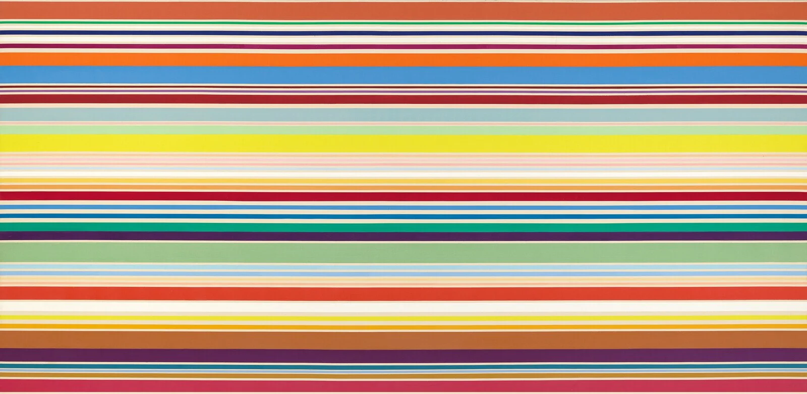
FOR THOSE WHO LIKE TO WATCH PAINT DRY
Stephanie told me that in his New York loft, Noland worked on lengths of unprimed canvas seven or eight feet wide, with several canvases spread across the floor at once.
Before beginning, he would sometimes set himself a problem: work from hot colors to cold ones, for example.
He mixed all the colors beforehand and kept each one in a separate jar. It was as though he established the palette before beginning the painting. Once he started, he almost never changed the colors.
This is very different from the way many painters work. We put something down, look at it, adjust the mixture, scrape something away, or change direction. Noland made many of his color decisions before the paint touched the canvas. The act of painting tested those decisions.
He sometimes made studies on smaller canvases. He gave them away as gifts, but did not sign them.
His brother Neil worked as one of his assistants, as did Kikuo Saito. Years later, I spoke to the painter Michael Williams, who had assisted Noland on the later shaped paintings. Michael said that Noland was intensely private about mixing his colors. Although Michael worked closely beside him, he never saw him mix them.
The stripes were made with ordinary beige masking tape. This was before the highly specialized painter’s tapes available now, and the tape could bleed.
Noland did not seal the tape with medium before applying the paint. He burnished it, pressing and rubbing the edges down carefully against the canvas.
A taped edge may sound mechanical, but it was not necessarily perfect. The absorbent canvas, the thin paint, the pressure on the tape, and the occasional bleed all remained part of the surface.
Michael also remembered Noland using a rug buffer on stained areas. The buffer changed the color slightly, muting it.
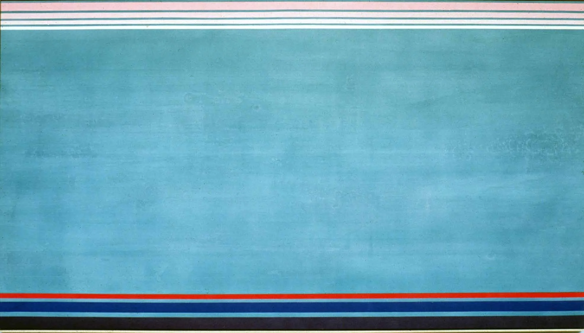
Kenneth Noland, NORTH SOUTH EAST WEST, 1990, acrylic on canvas, 66 ⅝ × 120 inches. Black Mountain College Collection, gift of the Artist, 1992.01.24. © Estate of Kenneth Noland / Artists Rights Society (ARS), New York.
One of my favorite details concerns Noland’s early inventory system. When a stripe painting was finished, a piece would be cut from the end of the canvas. Because the stripes extended all the way across, this narrow remnant contained a sample of every color in the painting.
On it he recorded the dimensions, date, and destination of the work—André Emmerich Gallery, for example.
At a time when good color photographs were difficult and expensive, this gave him an accurate record of the painting’s palette. A black-and-white photograph of one of these works would have been practically useless.
Years later, when Mary Barnes worked for him, she developed an inventory sheet containing an image, title, medium, date, location, and collector, with several spaces for changes in location or ownership.
I was given a copy of one of those sheets and adapted it for my first inventory system, long before any of this was digital.
The cropping of the paintings was also part of their making.
Michael told me that after all the color had been applied, Noland would position himself above the canvas so that he could look down on it. Michael would place large rolls of paper over portions of the painting and move them slowly, changing the proposed edge.
As Michael inched the paper into a new position, he would sometimes feel that it had reached the right place. A smile would come over his face, and at that same moment Noland would tell him to stop.
They had both seen it.
The proportions of the painting and the intervals of color had arrived at a relation that felt exact. Move the edge slightly in either direction and the color behaved differently.
For me, Michael’s story suggests a vibrational quality in the paintings. When the size and shape of the canvas came into alignment with the color, something happened that both men could feel.
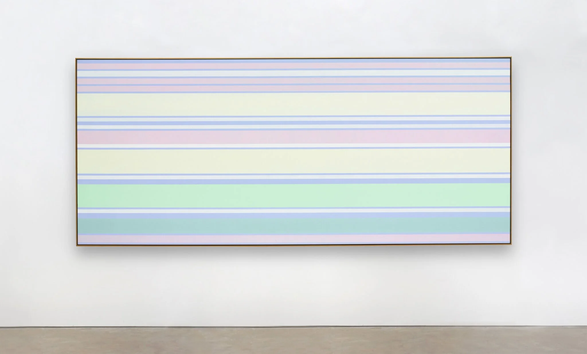
Kenneth Noland, Minted Morning, 2003, acrylic on canvas, 49-1/2″ x 116-1/4″
I do not know whether Noland would have described it that way. But it was how Michael experienced it.
In the 1970s and 1980s, Noland carried this attention to the edge into increasingly irregular shaped canvases. The stripes and bands remained, but the rectangle was no longer taken for granted. The outside shape of the painting entered into the color structure. The painted bands followed, contradicted, or cut across the angles of the canvas.
When I think about Noland now, I remember the practical man who came to our studios at Bennington and talked to us about how to keep working. I also think about the jars of premixed color, the masking tape rubbed down by hand, the narrow strip of painted canvas saved as an inventory record, and Michael moving a roll of paper a fraction of an inch.
In reproduction, the paintings can look almost self-evident: colored stripes arranged across a canvas. In front of them, the differences become physical. One band advances. Another seems to widen or contract because of the colors beside it. A pale stripe interrupts the rhythm. The long format exceeds the eye’s comfortable field of vision.
A color changed when another color touched it. The entire painting changed when its edge moved an inch.
And at the right point, they knew to stop.
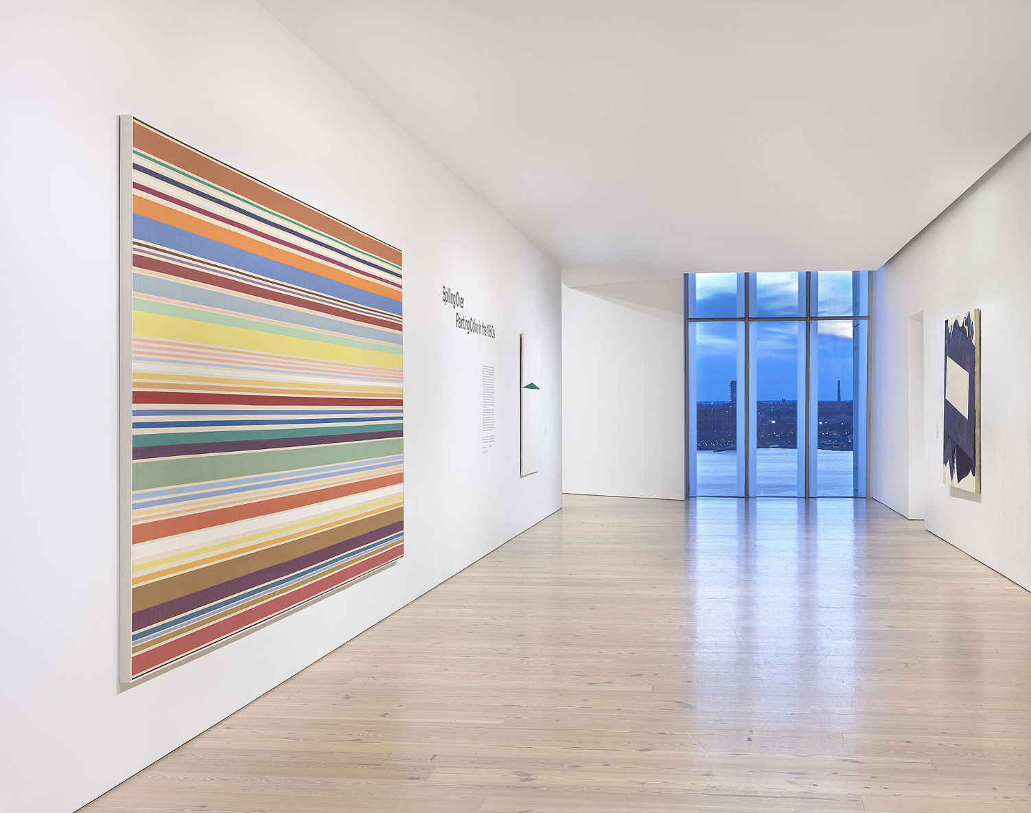
Installation view of Spilling Over: Painting Color in the 1960s (Whitney Museum of American Art, New York, March 29-August 2019). From left to right: Kenneth Noland, New Day, 1967; Carmen Herrera, Blanco y Verde, 1959; Robert Reed, Plum Nellie, Sea Stone, 1972. Photograph by Ron Amstutz
ON SCREEN: Painters Painting is a 1972 documentary in which many of the artists who shaped postwar American painting—including Kenneth Noland and Frank Stella—speak about what they were trying to do and how they arrived there. It brings us close to the moment when the stripe, the stain, the shaped canvas, and the flat field of color were still urgent discoveries rather than art-historical categories.
YOU MAY ALSO LIKE: