
June Notes - 2026
LIVING IN A MATERIAL WORLD:
BELLINI, COCHINEAL, RED, MANUSCRIPTS AND WHAT PAINT KNOWS
This month, I have been painting and writing almost in equal measure.
The blog is part of that, but not all of it. I have also been working on the memoir and short stories, and I am beginning to understand that writing is not separate from the studio. It is another way of looking.
Painting, writing, and art history have always been part of my life, but lately they have begun to braid together more tightly. I read something, and it sends me to a painting. I look at a painting, and it sends me into materials. I learn about a pigment, and suddenly I am thinking about trade, empire, insects, cloth, military uniforms, Rembrandt, Titian, and a Dutch inventor who somehow built a submarine and still died broke.
This is what happened in June.
I began with Gentile Bellini.
Bellini’s portrait of Sultan Mehmed II has been nagging at me for years, partly because it does not behave like a straightforward Venetian portrait. The face is modeled with light and shadow, but the arch, the textiles, the pattern, and the contained space around the Sultan seem to belong to another visual language. That led me first into the story of Bellini’s journey to Constantinople, and then into the materials themselves: wood panel, burnished paper, oil, gum arabic, lead white, lapis lazuli, brushes, and the different ways artists have tried to bring light into color.
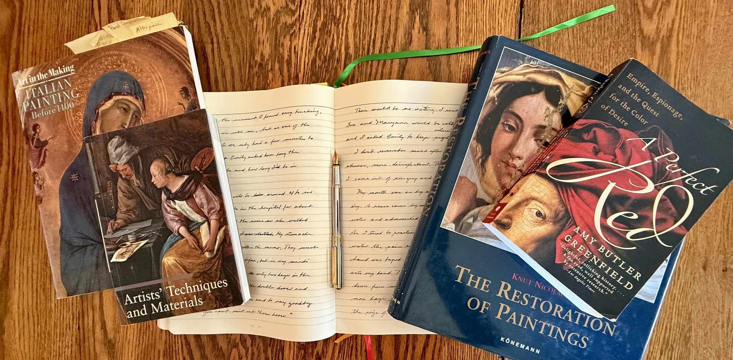
From there, I went to Amy Butler Greenfield’s A Perfect Red, a book about cochineal and the history of scarlet. That book has already spun me off in several directions. A color is not just a color. It is history, trade, commerce, labor, chemistry, secrecy, status, and art. Red led me to Titian and Rembrandt. It also led me to Cornelis Drebbel, an inventor who built one of the first working submarines, discovered a brilliant cochineal scarlet, failed to profit from it, and ended up with a lunar crater named after him.
It has been that kind of month.
More in it than about it.
BELLINI AND THE SULTAN
There is a portrait of Sultan Mehmed II in the National Gallery in London that has been nagging at me for years.
The first time I saw it, I was not thinking about diplomacy, trade, or the fall of Constantinople. I was looking at the painting itself.
The arch around the figure did not feel like ordinary Renaissance architecture to me. It felt like the edge of a manuscript page. The decorated cloth, the jewels, the gold, the contained darkness behind the Sultan, all of it seemed closer to ornament, calligraphy, and courtly display than to the kind of Venetian portrait I thought I knew.
Even the profile seemed to have crossed a border.
Something about the painting felt translated. Not wrong. More like a sentence spoken in another accent. The grammar was familiar, but something underneath it had shifted.

Gentile Bellini, The Sultan Mehmet II, 1480,
National Gallery, London.
ALSO NEW THIS MONTH

MATERIAL EVIDENCE: BELLINI, MEHMED AND WHAT PAINT KNOWS.
After writing about Gentile Bellini’s portrait of Sultan Mehmed II, I found myself asking a different question.
Not who commissioned the painting.
Not why Bellini was sent to Constantinople.
Not even whether he had been looking at Persian and Ottoman miniatures.
I wanted to know how the picture was made.
DID REMBRANDT HAVE TITIAN IN MIND?
While reading Amy Butler Greenfield’s A Perfect Red, I came across Titian’s portrait of Charles V on horseback.
The moment I saw it, I thought of Rembrandt’s The Polish Rider.
That surprised me. I do not know Rembrandt’s work particularly well, and I had never seen the two paintings discussed together. But the connection was immediate. Not scholarly. Not proven. Just visual.
There they were: two riders, two horses, two paintings separated by roughly a century, and something in the structure of one seemed to call out to the other.
Did Rembrandt know Titian’s painting?

FROM THE LIBRARY: A PERFECT RED by Amy Butler Greenfield
I have been reading Amy Butler Greenfield’s A Perfect Red, and it has already sent me off in several directions.
That is usually how I know a book is working on me. It does not stay inside its own covers. It starts attaching itself to other things I am looking at, writing about, or painting. From this one book, I found my way to Rembrandt, to cochineal, to Cornelis Drebbel, to military uniforms, to trade routes, to insects, to empire, to the astonishing fact that a color can carry half the world inside it.
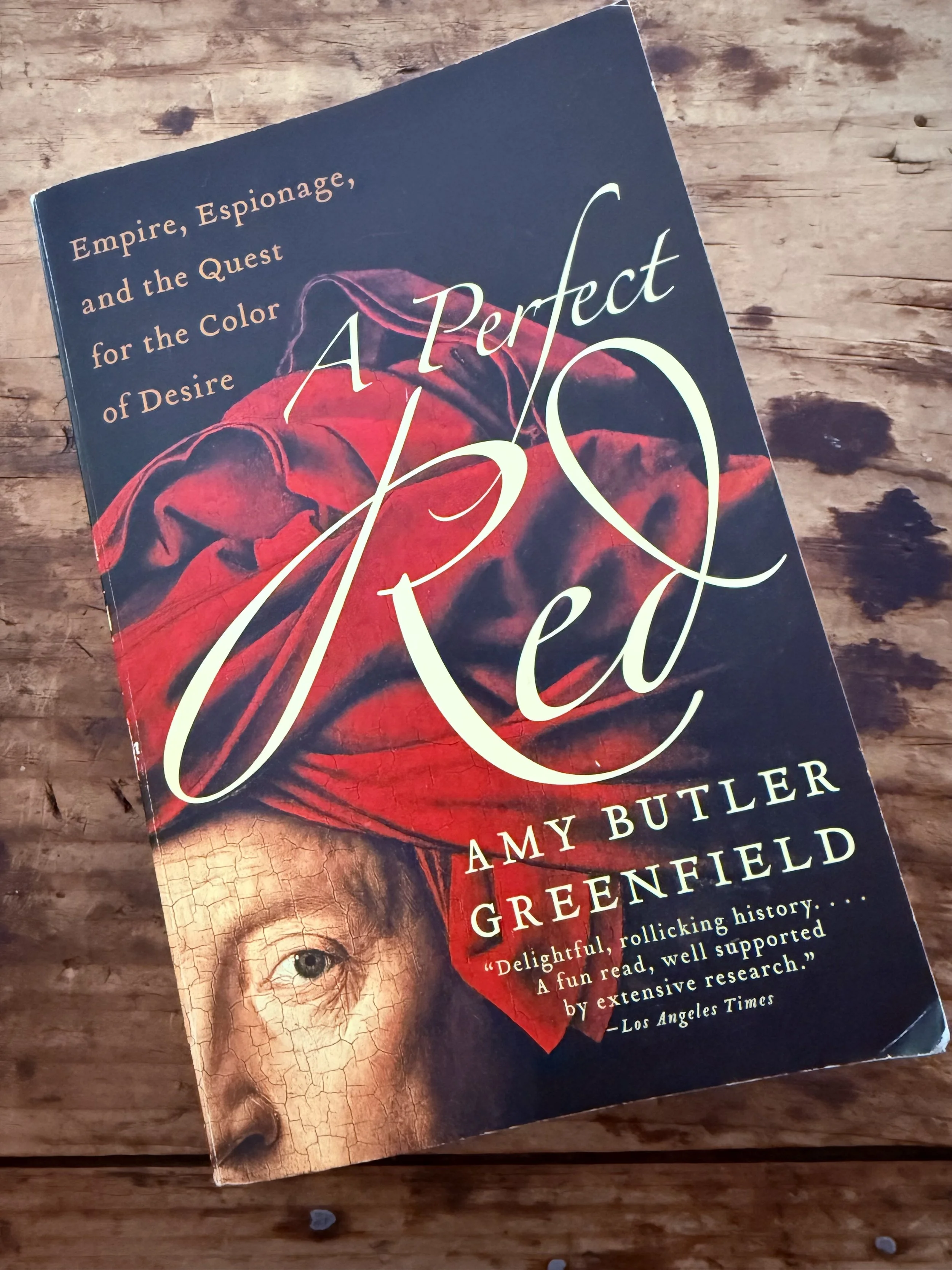
That is the great subject of A Perfect Red: not red as an idea, or red as a symbol, but red as a material fact. A color made from tiny insects. A color people desired, guarded, stole, traded, imitated, taxed, wore, painted with, and fought over.
A color is never just a color.
It is history. It is commerce. It is labor. It is secrecy. It is art. It is agriculture, and chemistry, and conquest. It is a luxury good, a status marker, a technical problem, and a visual thrill.
For a painter, this is irresistible. We spend our lives thinking about color as sensation, but every pigment and dye has a life before it reaches the eye. Someone found it. Someone harvested it. Someone ground it, boiled it, transported it, sold it, protected it, adulterated it, or tried to make a cheaper version. The color arrives with a past.
That is what I loved about this book. It restores consequence to color. It reminds you that beauty is not innocent, and that the materials of art are never separate from the world that produces them.
Red, in Greenfield’s telling, is not simply beautiful.
It is expensive, dangerous, coveted, political, and alive.
THE INVENTOR WHO ACCIDENTALLY DYED THE BRITISH ARMY RED
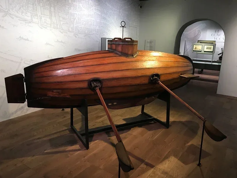
I found Cornelis Drebbel the way you find the best characters: in a footnote in someone else’s story.
He turns up in Amy Butler Greenfield’s A Perfect Red, which I’m reading this month, as the man behind the brilliant scarlet that made cochineal even more valuable than it already was. But the dye was only one piece of him. Drebbel was an inventor, an engraver, a chemist, a maker of improbable machines, and, apparently, a man spectacularly bad at converting genius into money.
He was born in Alkmaar, Holland, in 1572, trained as an engraver, and eventually made his way to England, where King James I became his patron. If you begin listing his inventions, he starts to sound like a fictional character. A “perpetual motion” clock powered by changes in air pressure and temperature. Early experiments with thermometers. Possibly an early compound microscope. Self-regulating ovens. Fountains. Optical devices. Court entertainments. Then, because that was not enough, he built a submarine.
ON SCREEN: Sergei Parajanov’s The Color of Pomegranates
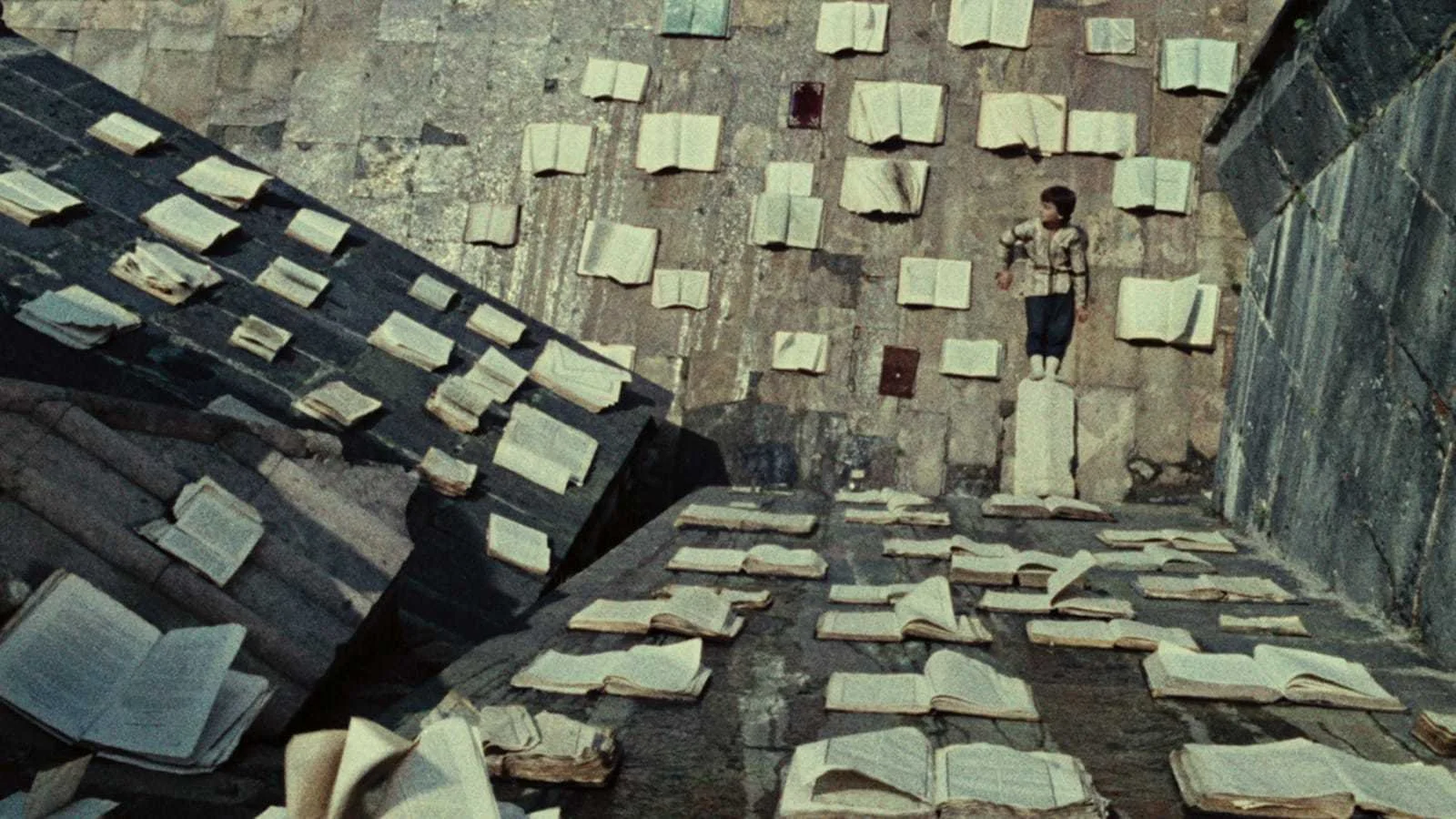
Photo still from The Color of Pomagranetes - Janus Films
I included Sergei Parajanov’s The Color of Pomegranates this month because it feels less like a film than a sequence of living manuscript pages. Made in 1969, the film is a highly stylized portrait of the Armenian poet Sayat-Nova, but it does not tell his life in any conventional biographical way. It builds meaning through color, gesture, cloth, fruit, books, ritual objects, and stillness.
That made it feel right for this Studio Notes. After writing about Bellini, Islamic manuscripts, cochineal, red dyes, and the material life of color, I wanted a film that understood images as objects with weight and history. The Color of Pomegranates does that. It treats color not as decoration, but as language.
FEATURED ART: FALLING, FALLING
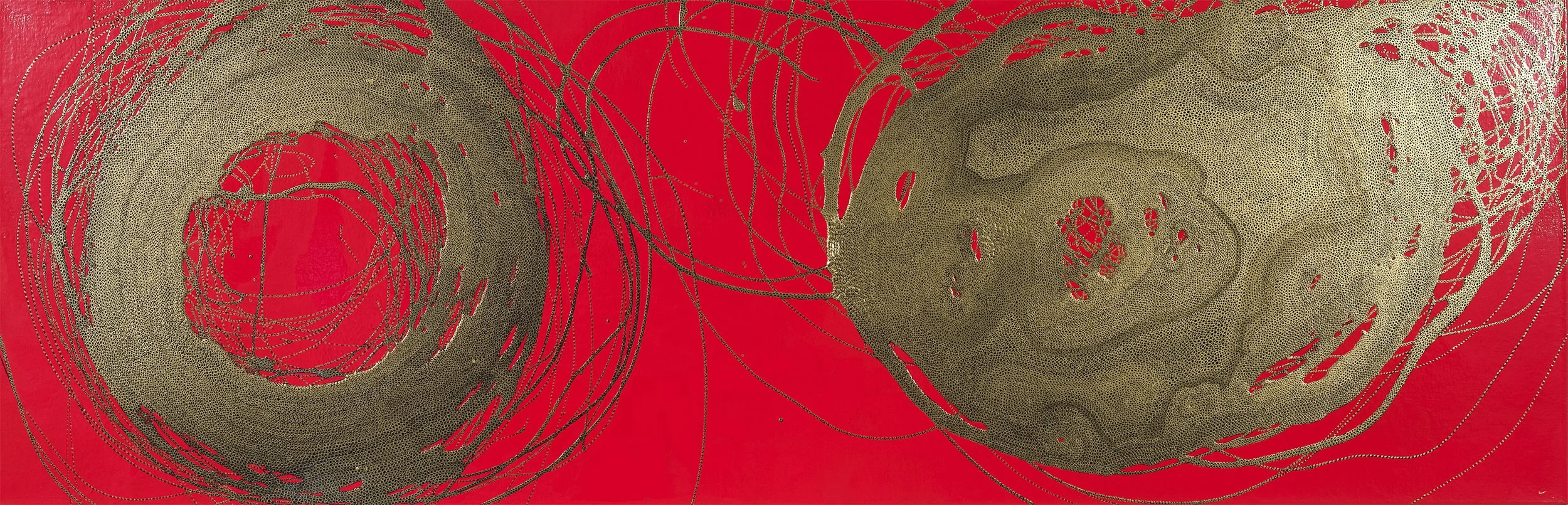
“Falling, Falling," 30 inches x 74 inches, oil paint and acrylic markers on canvas, © 2025 Leslie Parke
Since we are talking about red, I thought I’d add a painting where red is doing the heavy lifting.