BRIDGET RILEY: WHY THE STRIPES?
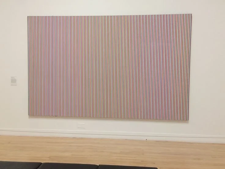
Bridget Riley, Late Morning, 1967-8, Polyvinyl acetate paint on canvas*
When people first encounter Bridget Riley's stripe paintings, they often assume the work is highly calculated. The stripes appear so precise, so controlled, that it is easy to imagine a system determining the outcome. The reality is more interesting. Riley was not trying to make a system. She was trying to understand color. By the late 1960s, she had reached a problem that many painters encounter. Form and color seemed to be competing with one another. Complex shapes carried their own visual weight. They distracted from the very thing she wanted to study: what color does when it encounters another color. To solve that problem, she simplified the form. She chose the stripe. Not because stripes interested her, but because they were stable. A stripe has direction and width, but very little personality. Repeated across a canvas, it creates a structure strong enough to hold a painting together while leaving color free to do the real work. The stripe became a laboratory for seeing. What fascinates me is how physical Riley's process actually was. The paintings may look as though they were generated by a theory, but they were built through observation. She began with small gouache studies, often on graph paper. She mixed her own colors, then tested them against one another. A slightly warmer red, a cooler blue, a stripe made narrower or wider—each change altered the experience of the whole.
Later, she developed a method of painting colored strips of paper and physically moving them around. She would rearrange sequences, remove colors, insert new ones, and study what happened at every boundary where one stripe touched another. In other words, she did not calculate the paintings. She looked at them. Then she looked again. And then again. The process could take months. Once a sequence finally worked, Riley made a full-scale cartoon that established the dimensions and color order of the final painting. The finished canvas was then painted by assistants working under her direction. This surprises many people, but it makes perfect sense. For Riley, the artwork was not the brushstroke. The artwork was the visual event that occurred when colors interacted. Delegating execution allowed her to focus on the thing she cared about most: seeing.
What was she after? Not decoration. Not optical tricks. Certainly not the cold, mechanical reputation often attached to Op Art. She was interested in what happens between colors. A color is never entirely itself. It changes according to what surrounds it. Place a blue beside a green, and it behaves one way. Place the same blue beside an orange, and it becomes something else. The eye begins to generate sensations that are not literally painted on the canvas. The painting becomes active. Riley often compared this experience to music. A note acquires meaning through its relationship to the notes around it. Color behaves in much the same way. No stripe exists in isolation. Each one alters every stripe around it.
That is why her paintings continue to move, even though nothing in them actually moves.
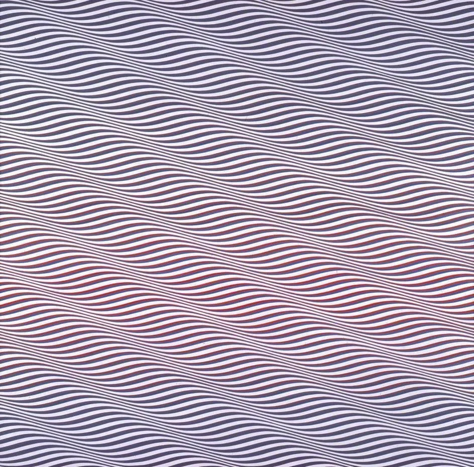
Bridget Riley, Cataract 3, 1967
The more I read Riley, the less interested I become in the stripes themselves. The stripes are simply a vehicle. The real subject is perception. She wanted the eye to move across a painting the way it moves across nature—lingering here, glancing there, discovering relationships, losing them, finding them again. Seen this way, the stripe paintings are not rigid at all. They are among the most fluid paintings of the twentieth century. The structure remains fixed. The experience never does.
*Riley used polyvinyl acetate paint, a water-based synthetic paint related to modern emulsion or house paint. Its flat, even surface suited her purpose: the stripes did not need the drama of the brushstroke. They needed clarity, edge, and color held steady enough for the eye to do the moving.
YOU MAY ALSO LIKE . . .